Intro
I didn’t know product design existed. Born and raised in Jakarta, Indonesia, I only discovered the world of UI/UX during my sophomore year of college. My parents didn’t even know what it was until I landed a junior year internship at Adobe – only then did they actually understand what I wanted to pursue in my career. For most of my life, the apps around me were just apps. Instagram was a place to share photos, Subway Surfers was a way for me to pass time (and get new high scores), and Google Maps was a way for me to plan the least-traffic routes. I didn’t think about why they look the way they did any more than I thought about why a menu, shopping mall, or street looked the way it did.
It wasn’t until I started designing for American audiences that I began connecting the dots between the products I grew up with and the ones I design today. While the visual language of everything back home in Jakarta felt second nature to me, moving to a new country meant suddenly being surrounded by an entirely unfamiliar one. The interfaces of American apps are extremely minimal in comparison to the loud over-information of Asian apps. Perhaps, I had to leave home to notice what it looked like.
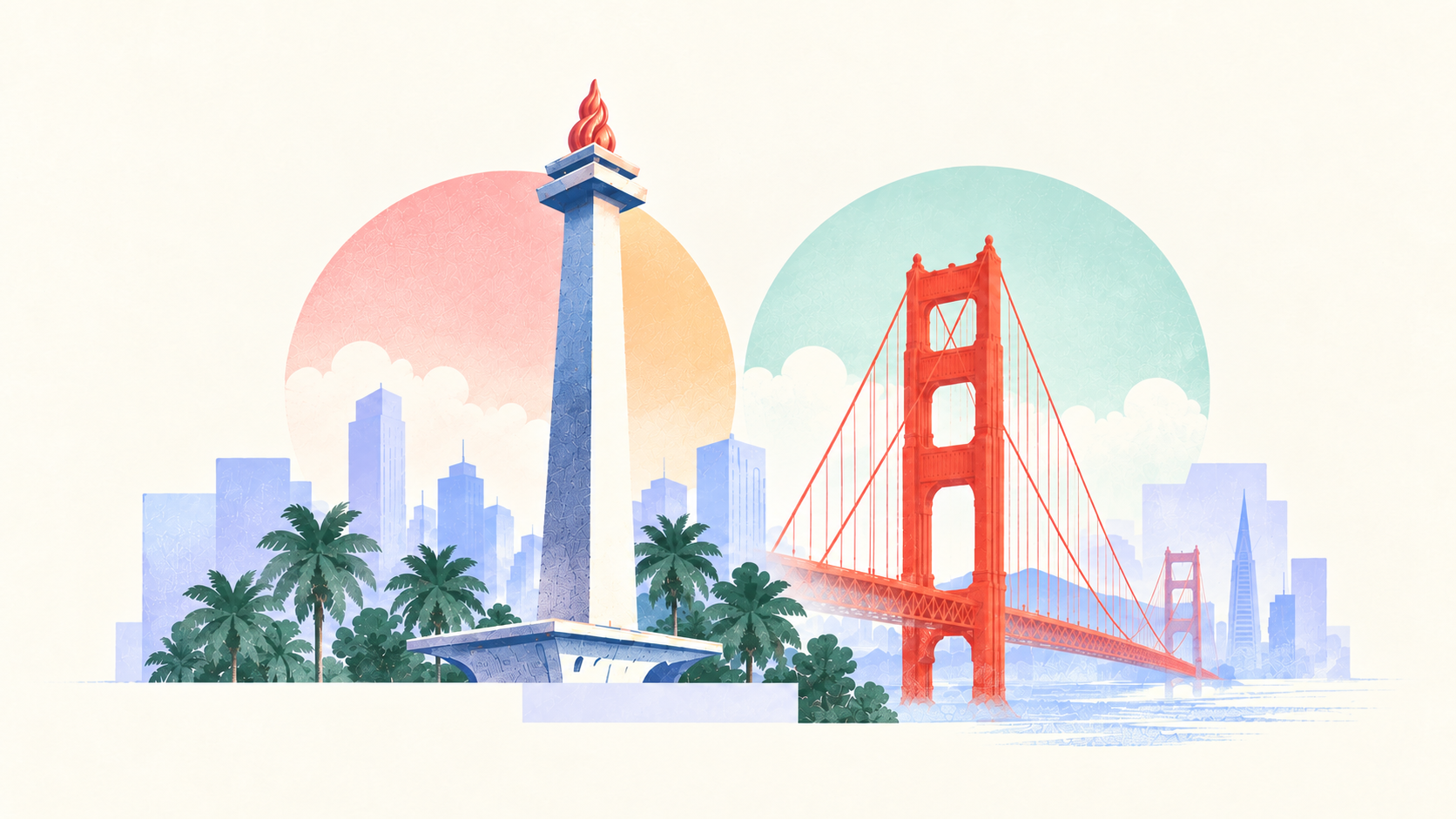
“Good design”
As I spend more time in America and in the tech industry, I’ve started to notice this subconscious collective idea of what good craft looks like. You see it in the bajillion startups building hyper-clean, ultra-modern landing pages, and you hear it in how often people use the word “taste.” Somewhere along the way, clean, simple, and minimal became treated as objective measures of design quality.
We’re taught that white space is sophisticated and that having too many choices on a screen leads to cognitive overload. In Silicon Valley, Apple has been the default answer to what “good design” is since the birth of interfaces. Everything is sleek, modern, and the model everyone in tech is trying to achieve.
But, even Apple’s own design principles make a distinction between simplicity and familiarity. To build something intuitive is to “build on what people know, drawing on concepts people already understand helps them feel immediately at home.”1 And everyone has a different definition of home. Familiarity has to come from somewhere. This is where culture enters and influences what we as users deem intuitive. By culture, I mean:
- What a person expects to find in a place
- How much information feels reassuring vs. overwhelming
- How people move around a city
- What kinds of interactions happen every day
- What other products have trained them to recognize patterns
I’m not saying clean design shouldn’t be the standard, nor am I saying that everything needs to be loud. What I’m expressing is that just like people, products inherit the environments they grow up in. There is no explicit right or wrong answer.
Uber vs. Gojek
A prime example of how culture influences a product can be seen between Uber and Gojek. Both are ride-hailing apps, both are top of the App Store in their respective countries, and both solve the issue of helping you travel from point A to point B with a supply-demand algorithm that matches riders to drivers. But, as soon as you open the app and land on the home page, you are greeted with very different product philosophies.

Gojek’s home screen surfaces transportation, food, payments, and other services all at once, reflecting how Indonesians like the comfort of all their options laid out in front of them because that’s what we’re used to. The bustling streets with endless motorcycles and night markets are what brings us the comfort of knowing we have everything within an arm’s reach.
On the flip side, while Uber’s business has expanded far beyond ride-sharing too, in 2023 they redesigned their product with the goal of simplifying the home screen and reducing the number of taps, tucking the broader catalog of offerings into a tab.2
To an American user who’s used to the clean simplicity of Apple and Airbnb, Gojek might initially be “busy” – but busy compared to what? And for whom? Neither Uber or Gojek’s approach is inherently more sophisticated or “correct,” the designers behind each product are simply making different bets about discovery, familiarity, and hierarchy.
Wrap up
Picking up product design, I thought I had to learn a set of rules: reduce user friction, simplify the screens, create hierarchy. I still believe in those things, but as I continue to build, I realize that maybe the best and most intuitive apps aren’t those that are the most clean or modern, but rather the ones that understand a place, a behavior, a person well enough to make it feel second-nature to them.
The relationship between culture and interface design isn’t always obvious. That’s probably because so much of culture is subconscious, it’s just the way things are. What fascinated me was realizing that many of the forces shaping these products don’t originate in technology at all. They come from the way people eat, shop, move, and communicate, and eventually, those behaviors make their way into the interface.
The apps around me used to just be apps. Now I see them as something else: small reflections of how people live. Maybe culture was always there in the pixels, I just had to learn how to notice it.